This is a capstone project wherein I have applied the learnings I’ve acquired from the course I took. Showing how content is structured and organised to shape an experience for the user. But also combining what I’ve learned from the User interface course in order to produce a functional process for UI / UX development.
We were asked to come up with our own app. I thought of creating an app related to books, simply because I love to read books.
But also I noticed that reading these days has now become a race to finish the book rather than find meaning within it. Or at times we simply just want to simply tick off the books from our reading list. We are unable to absorb the words on pages and reflect on it deeply.


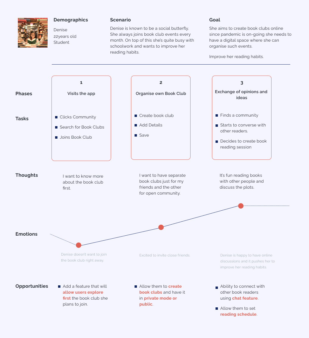
I believe that creating a mobile app will allow the users to find cohorts they can resonate with. Especially with the kind of books they read.
I believe that creating this app that allows users to curate an effective reading list according to their own preferences will contribute to their personal growth.
I believe that creating this app will allow the user to develop a more mindful reading habits by providing a Reading Schedule.


After some tweaking from the Lo-fi wireframes, I have finally finished the design. Visually, I believe this is up to par with other existing apps that I have searched before.
I was able to flesh out my assumptions, goals of my user personas and target users through this design. But it doesn’t mean that my work on this project ends. There will still be improvements that needs to be done.


I struggled how to structure my content and site map. Because I want to put in a lot of features in the app. Only to realise that some of those features were unnecessary and doesn’t add any value at all. So what I did was to look back on my list of objectives, assumptions and goals that I want to achieve. It really helps when you’ve set these details early on. This will help you align your content and features you want to create.
Second, this is the first time that I actually made a cohesive product. I struggled with time management. It took me 3 weeks to create the capstone project as I spent so much time looking for inspiration. I also dwell too much visual design and quite indecisive of the visual forms to create. The artsiness in me won over than logic.
Like I said before, I put a lot of thought into visual design. I believe that it helped me in communicating the right voice and tone of the app. A strategic way to differentiate my product from others. It also helped me to organise information overall. But I know that I can't rely on visual design alone. Visuals and whatnots won &apos t help me to fix its usability and functions for the users. I must strike the balance between visual and usability.
I could’ve asked real people to test out this product. However, given that I am just new to this industry. I couldn’t do it since I have limited knowledge about Usability testing and conducting such experiments. I know through user testing I would’ve improved more the user experience. But also find what things I could have omitted or added in the product.
Best that I reached out to experts who have done this. Or be in an actual work environment, where colleagues can teach me these things.
By doing this project it helped me to think more logically. That UX goes beyond fancy concepts and framework. Each detail and features must have its logical purpose.
Don’t dwell too much on searching for inspiration in the internet. This will eat up so much of my time. Allot at least 30 mins. to an hour for this.
It made me realise that this pandemic that everyone's facing and has confined us to our homes pushed me to pursue this product. A simple way to establish connections and communicate with friends, and more often than not strangers too. Because let's face it, we are all experiencing collective stress at this point. So in this situation, we need an outlet to divert all these negative experiences.
Lastly, there’s no such thing as “DONE” in creating such product. No product is perfect in just one go. Its an endless journey of iterations that will help me improve the product I design. Obviously, this capstone project face another iterations for sure. Hopefully, I will be able to do usability testing at that point.